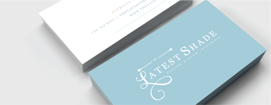
Some of my favorite design projects to work on are full branding and web design and seeing the whole brand come together with both the logo design and website. The Latest Shade is a custom window treatment business. I had the pleasure to work with Patrica on this design. I really wanted to create and brand for her that really matched her business as a whole. Patrica’s window treatment designs are elegant and sophisticated. I feel I was able to capture that in the logo design, it has been one of my favorite designs to date!
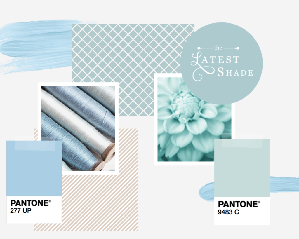
Designing The Mood Board
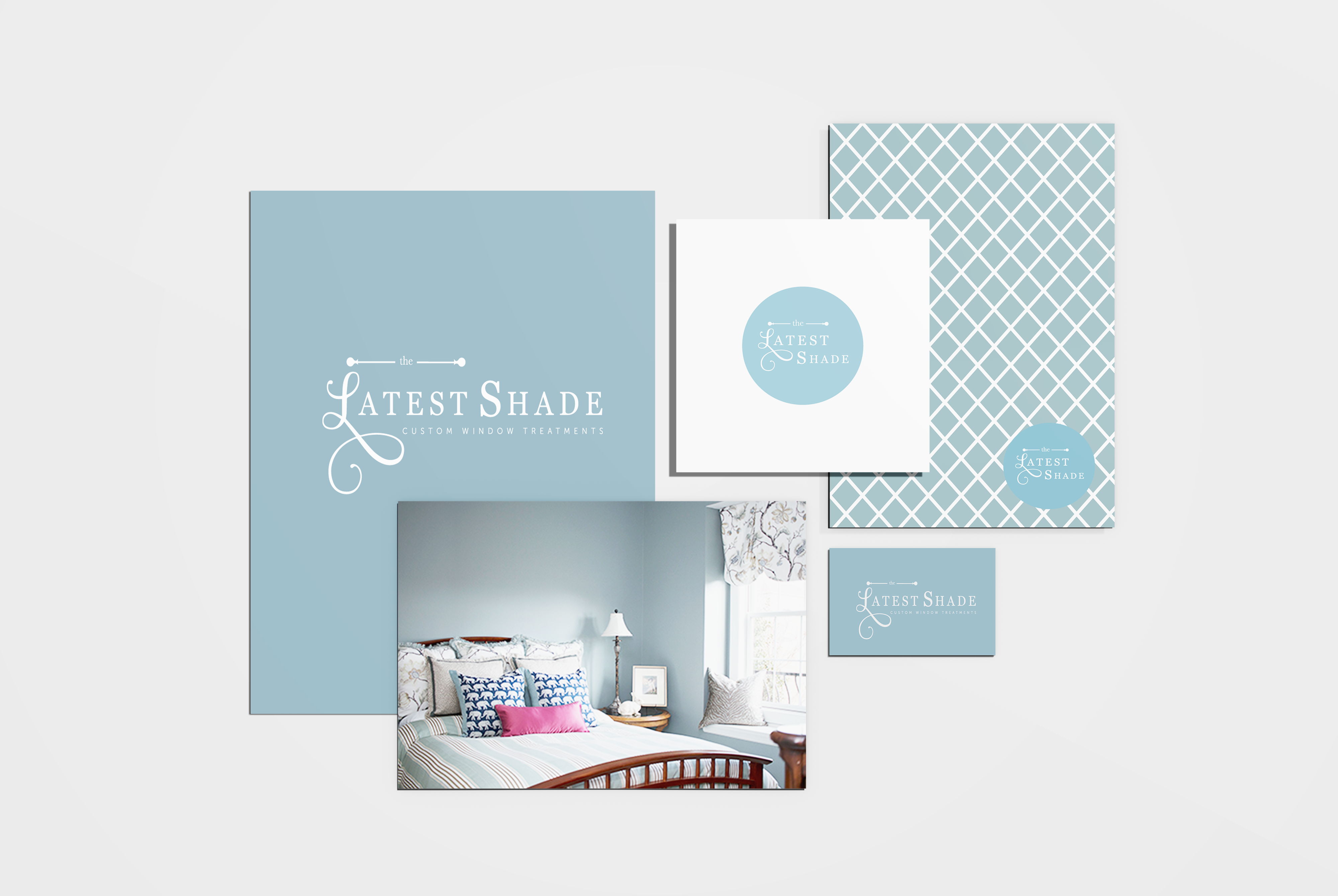
We choose a soft color palette for the brand, light neutral blues, and greens with an accent of soft tan and gray. This palette went along well with the neutral designs Patrica creates in her window treatment designs. We also incorporated some geometric patterns which reflected the sewing and process that goes into her business.
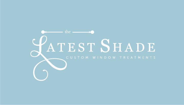
Final Logo Design
The final logo design incorporated the sophistication and high-end appeal of Patrica’s business. The “L” script is very eye-catching but also ties together the whole design. I had a lot of fun being creative designing this logo! I just love the dowel rod design tying in the business to the logo. The logo + branding package also includes a secondary logo. We created the design below to use for social media, fav icon for her website, and for instances when the main logo would not work for the design.
On To The Web Design
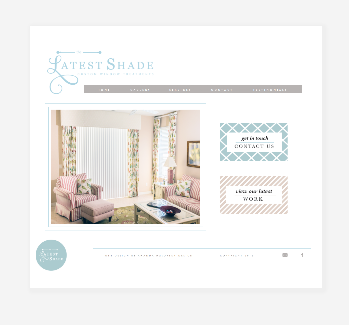
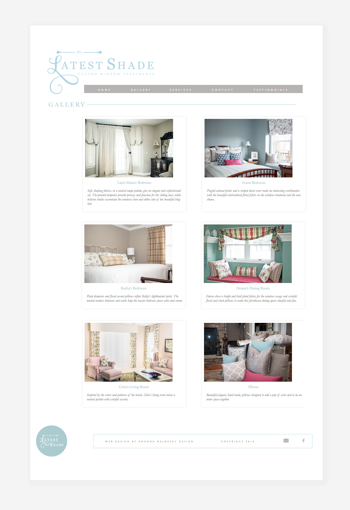
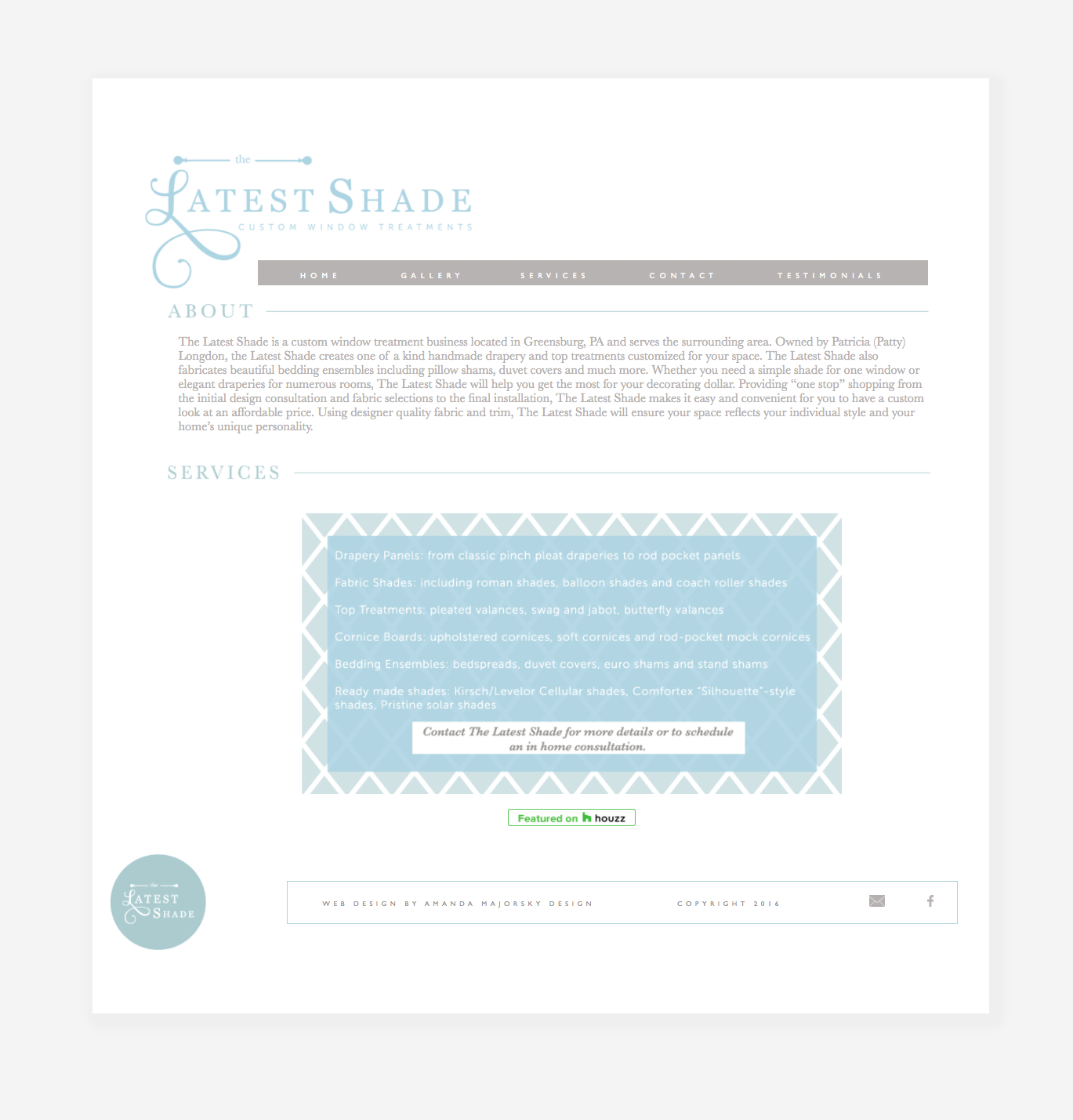
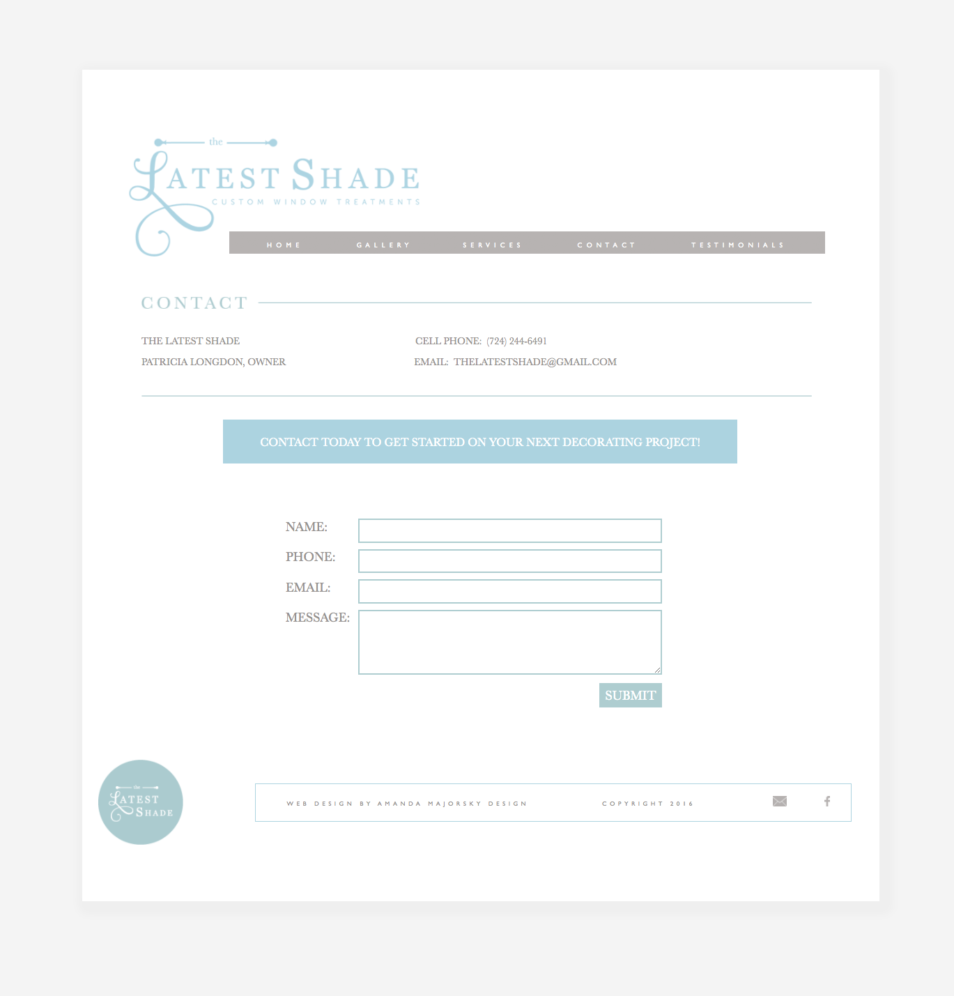
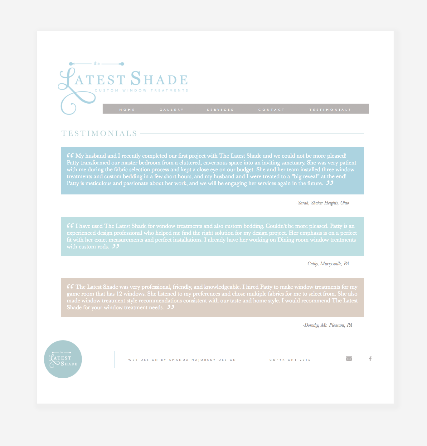
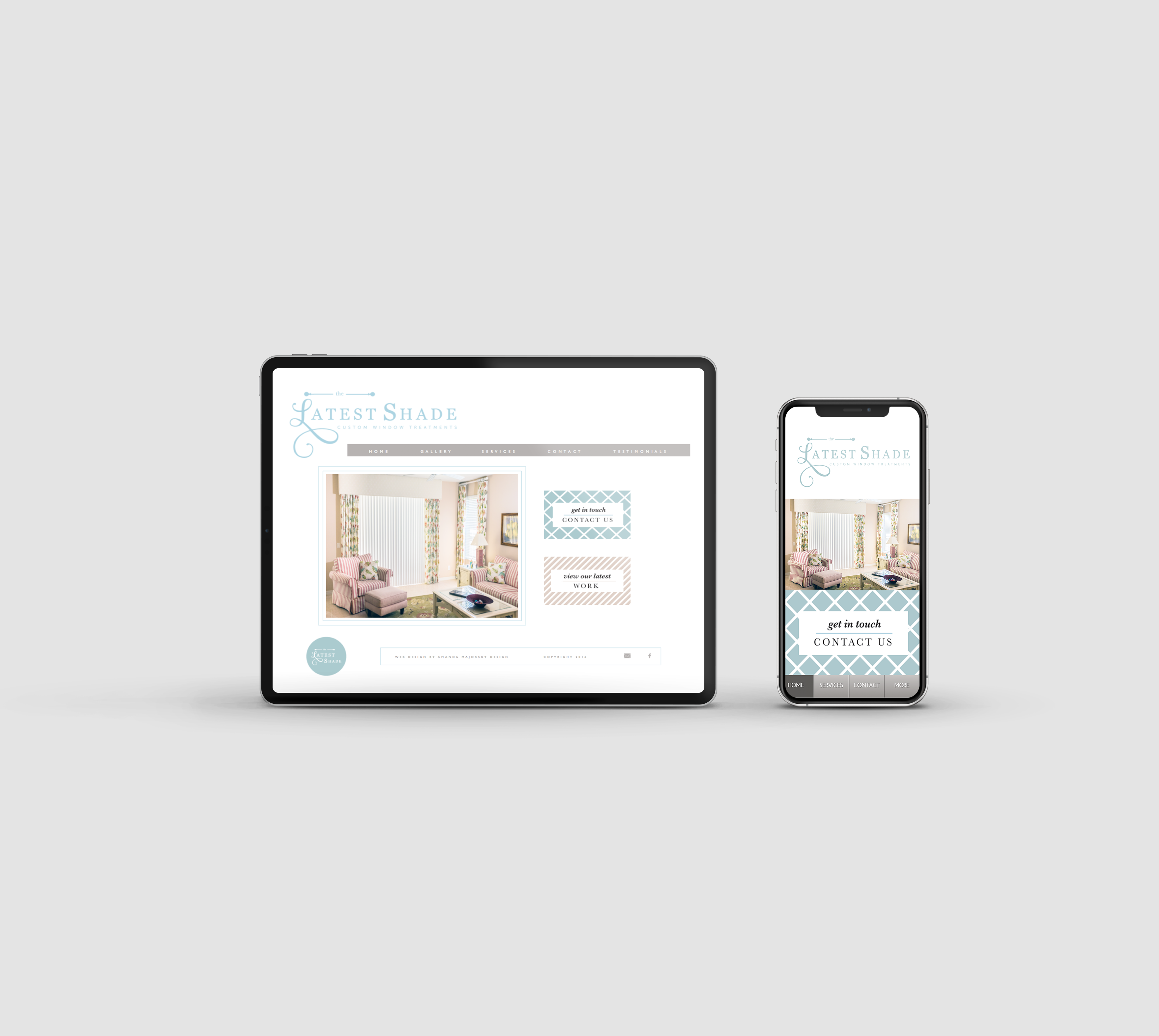
The Latest Shade wanted to create an online presence to be able to reach more customers and expand the business. The design for the website is modern but simple making her work the focal point of the site. The homepage features a large slideshow gallery of her work and a clickable call to actions making it super easy for users.


Leave a Reply